Molhem
An Arabic online publishing platform. Brand identity and a UX/UI redesign focused on conversion.
Overview
Molhem is a free platform for Arabic-speaking users, designed by the community for the community. People come to inspire and be inspired by others, sharing insights, ideas and creativity.
The brand identity
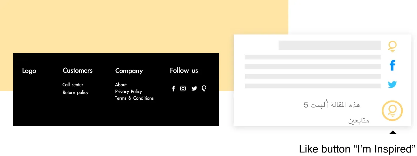
The brand portrays the idea of helping people find inspiration within the platform. I created an icon to identify the platform and give the site character, also using it as the “like” button for articles that inspire.
The UX process
Mission: conversion
The main challenge was to create a design that increased the conversion rate. To do that, I needed to answer two questions:
- Who are Molhem’s users?
- What is stopping them from signing up, and how do we fix it?
Molhem’s users
The previous Molhem MVP helped me understand its users. Based on existing user behaviour, analytics and the product owner’s view of what Molhem should be, I defined three personas:
- The Reader. A 32-year-old product manager with around an hour a day to herself. “I want a site where I can learn about different topics every day.” Frustrated by filling forms, wasting time searching for something to read, and small text.
- The Regular Blogger. A 41-year-old family therapist who shares parenting tips. “I want a platform where I can share my knowledge with as many people as possible.” Frustrated by not reaching a bigger audience on social media and having nowhere to share long articles.
- The Business Blogger. A 26-year-old social media officer at a cosmetics company. “I want a site with an editor that allows me to write, edit, and publish articles within deadlines.” Frustrated by conventional editors.
Problematic areas
Analysing the personas’ frustrations, I focused the redesign on:
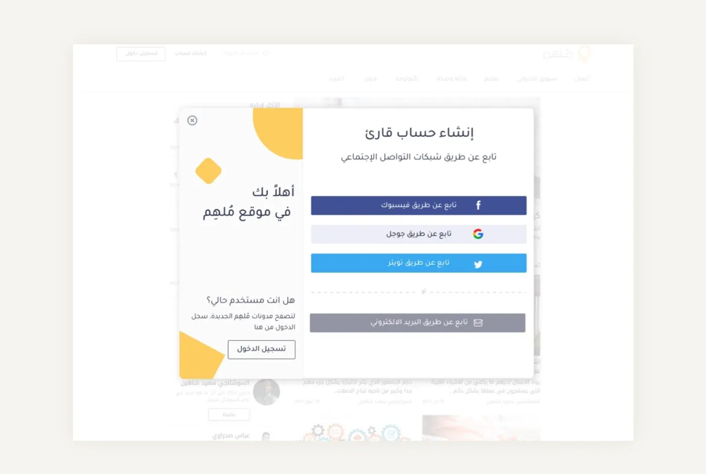
- Sign-up. One-click sign-up with social media makes signing up easier than ever for readers, with email still available.
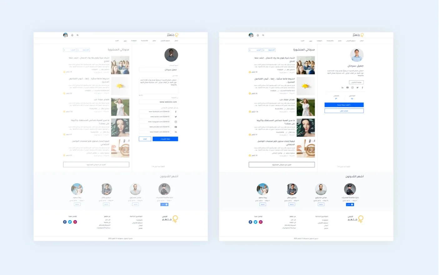
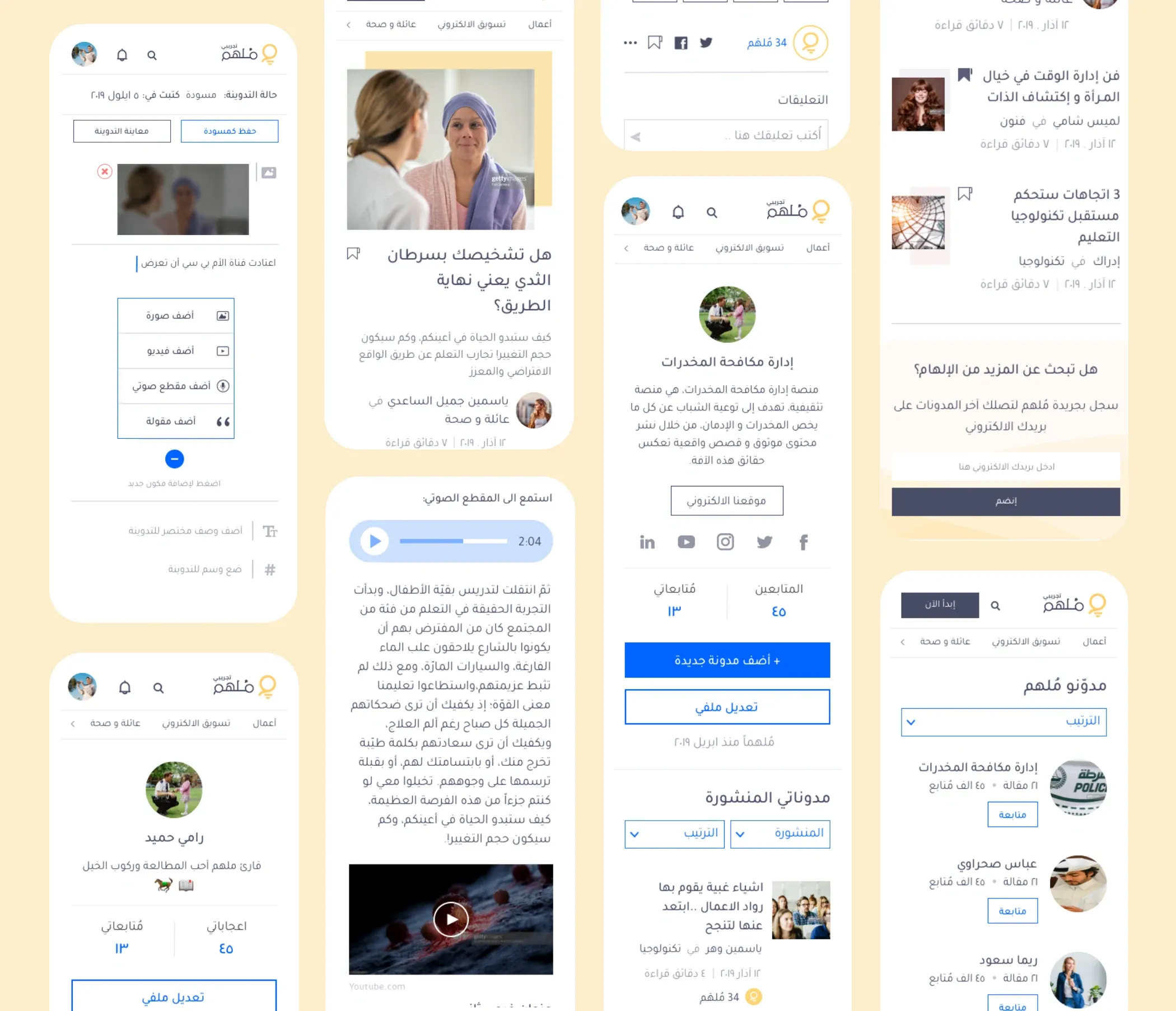
- The user’s profile. “I want parents to be able to find all of my articles in one place.” Writers find their published articles, sorting and filtering, a new-article entry point and profile editing on one page, keeping them focused and reducing bounce.
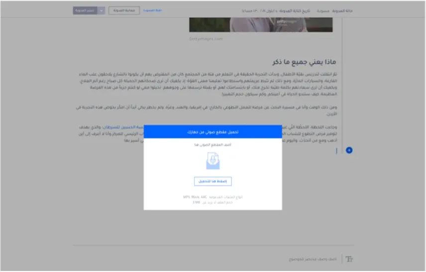
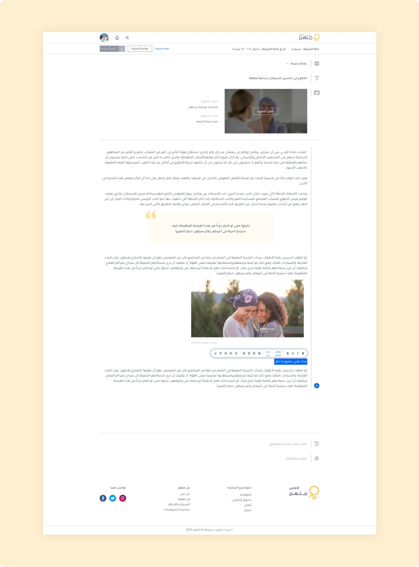
- The editor. “I want an easy to use editor to quickly write and publish articles for work.”
- The user interface.
The user interface
The mood board centred on minimalism, positivity, softness and breathing room.
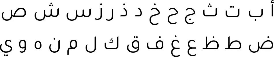
Choosing an Arabic typeface is challenging: there are few modern, crisp Arabic types that read well. Tajawal is an elegant, contemporary Arabic typeface with high readability and a range of styles.

Pages and interactions
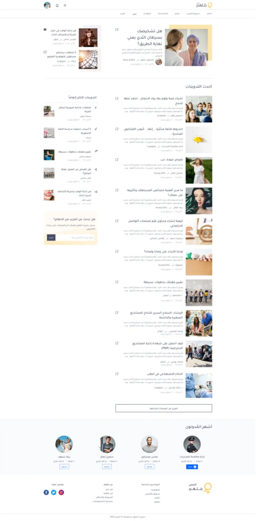
Feed
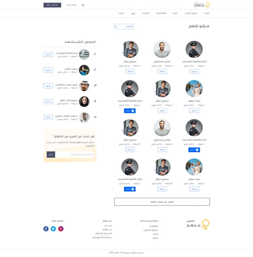
Writers
Scheduling
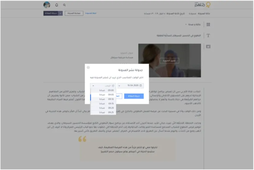
Editor dialog