Rakuten TV
A Smart TV streaming app. Fixing onboarding and registration to increase conversion.
Overview
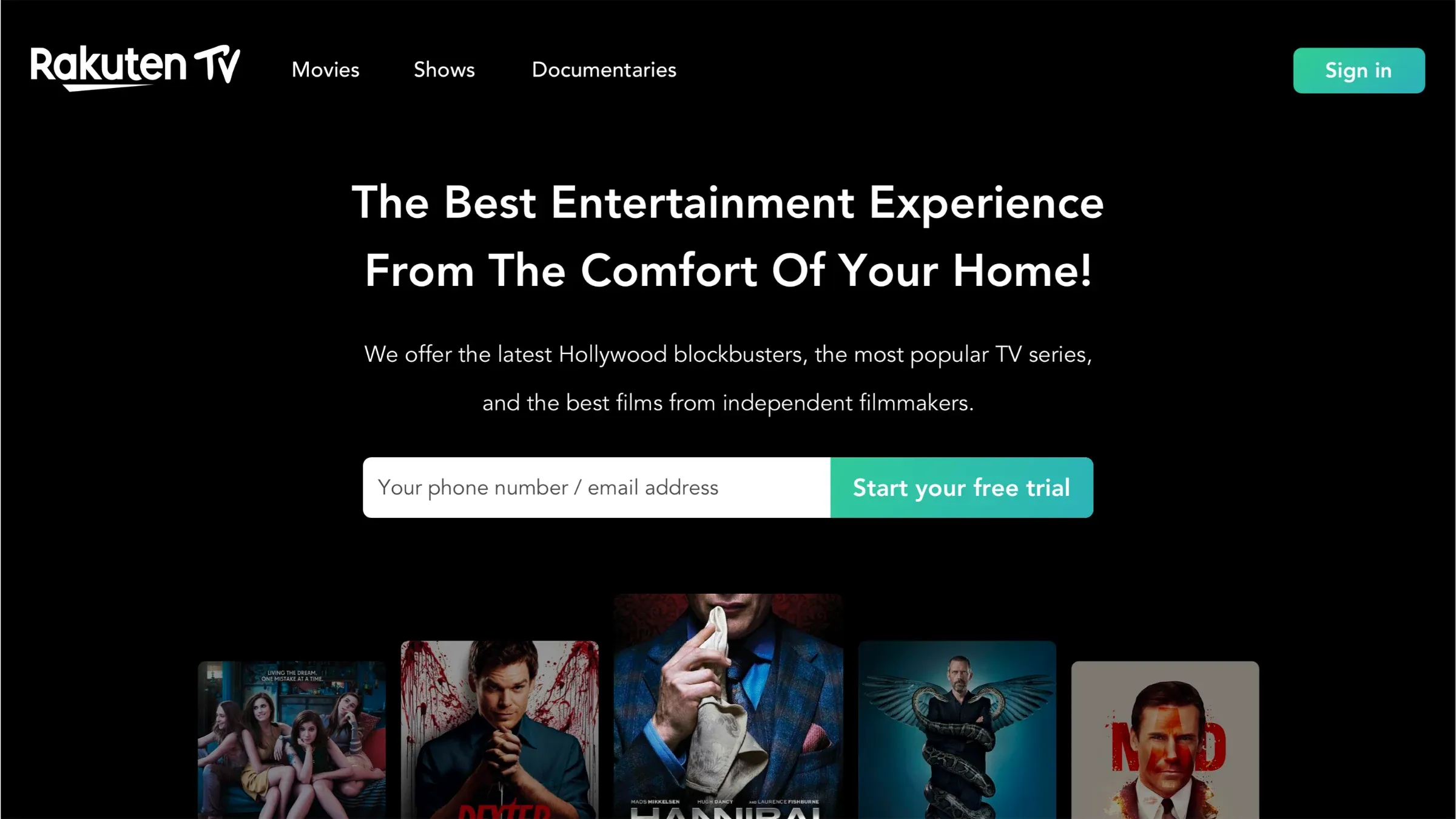
Rakuten TV is an online entertainment streaming platform competing with industry giants like Netflix and Disney. Apart from content, the existing user experience made it hard for users to register. The main goal was to fix the experience and increase conversion.
The challenges of designing for TV
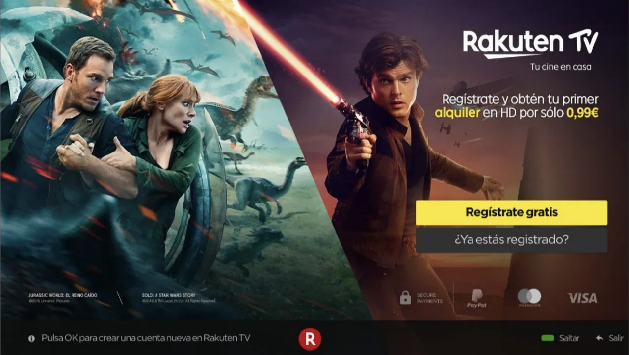
Problems users were facing with the existing app, which affected conversion:
- The onboarding. Filling out fields is usually irritating; adding the remote control to the equation is a huge pain point.
- The landing page. It carried a lot of secondary information that distracted users from registration.
- The payment. Distracting information and a multistep flow caused users to abandon the payment process.
- Legibility. TV apps have to allow legibility and comfortable interaction from the other end of the room.
- Navigation. Typing on a remote is usually a painful experience; the design needs to be intuitive and easy.
TV applications UX 101
Easy onboarding. Fewer clicks. Big fonts. Different devices need different experiences. People watch TV to have a relaxing, enjoyable time; if the TV experience is daunting, they can easily dismiss it in favour of other entertainment.
One of the major pain points is using the remote control to navigate the app and type in credentials. A smart design can save users from this gruelling experience.
Be in control
- Remote controls come in different shapes and sizes.
- X and OK buttons are universal.
- Use fewer buttons.
- Use voice commands.
Dim the lights
- TV screens are brighter than computer screens.
- People watch TV in the dark.
- Use darker colours to avoid straining users’ eyes.
Sign you up
- Make use of technology.
- Quick and easy onboarding.
- As few input fields as possible.
Big. Big. Fonts.
- People watch TV from afar.
- Primary font size ≥ 24px; secondary font size ≥ 18px.
The onboarding flow
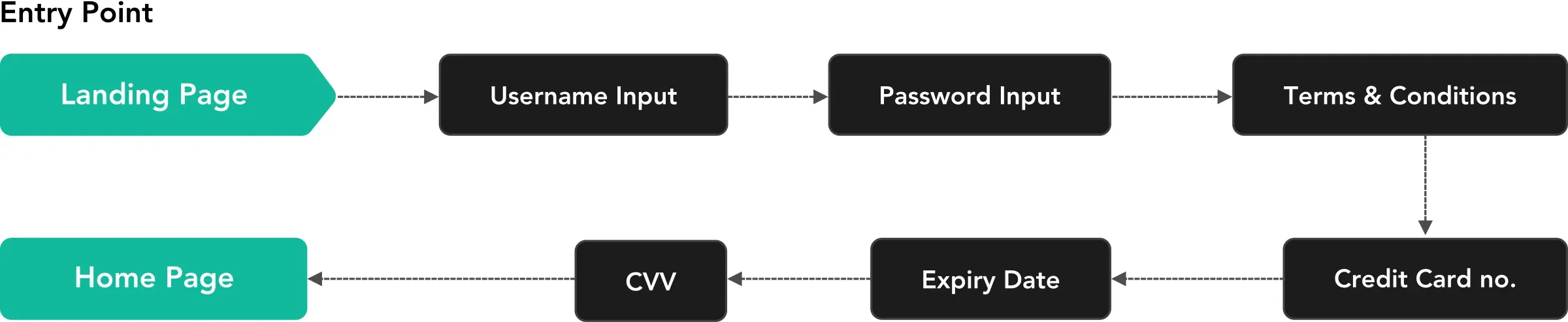
The existing onboarding flow violated TV design best practices. It had six steps with multiple fields to complete registration. With a TV remote, that is a nightmare.
User pain points
- Too many steps.
- Too many clicks to achieve the user’s goal.
- Keyboards on big screens cause eye strain.
What to do about it
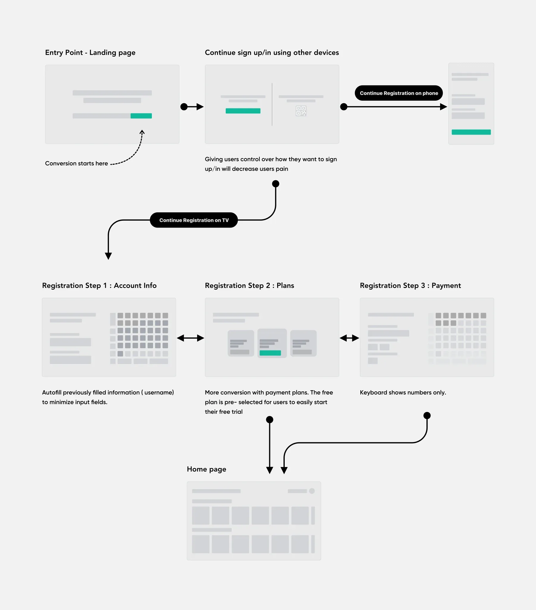
- Minimise the onboarding steps.
- Fewer clicks, faster navigation.
- Decrease the keyboard size.
Fixing the keyboard
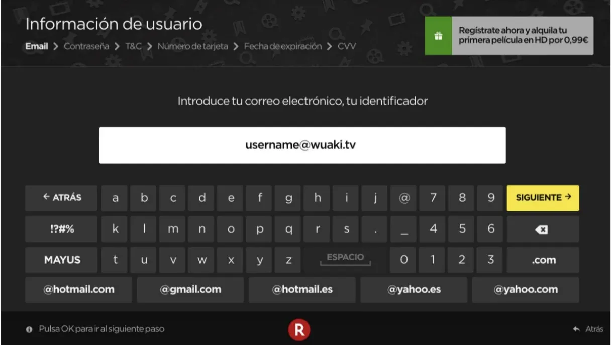
The keyboard was spread horizontally across the screen. On a 50-inch screen, a user’s eyes travel all the way right, left, up and down to fill out a form, which causes discomfort and can lead to abandoning the task.
Before
After
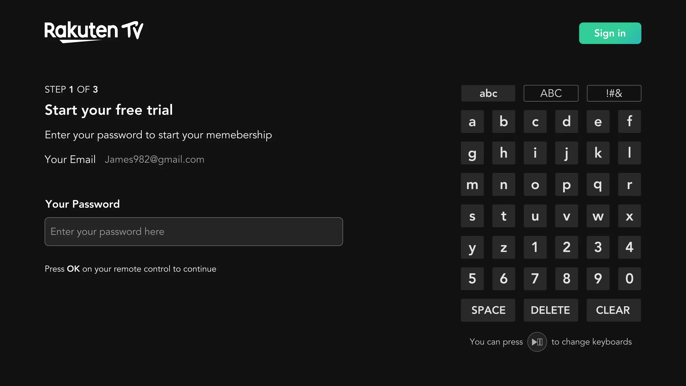
An intuitive keyboard redesign
- Minimising the click area by focusing the user’s attention on one part of the screen.
- Simplifying actions like Space, Delete and Clear, using text instead of ambiguous icons.
- Quick navigation using universal remote buttons like OK, Back and Forward to reduce effort and time on task.
Doing the work for users
- Offering frequently used input, such as email domains (@gmail.com), without users typing them manually.
- Matching the keyboard to the required input, for example a numeric keyboard for a field that needs numbers.