Stop arguing, start showing
Product kept telling us there was no time to fix navigation, while Support kept hearing versions of “where do I find this?” So we stopped arguing for the work and changed how Product encountered the evidence.
Product said there was no time to fix navigation
Pennylane, an all-in-one financial and accounting platform for SMEs and accounting firms, had grown from 4,000 customers to more than 40,000 in three years, while continuously adding new capabilities. That growth had created a navigation problem.
Early in my time as Product Design Manager for the Accounting stream, the IC designer and I ran an app-wide evaluation. Navigation emerged as one of the biggest issues. It went into the backlog and stayed there. Product’s answer was consistent: there was no time.
Meanwhile, Customer Support and Success were repeatedly hearing versions of the same question: “Where do I find this?”

So there was a known structural problem, a design team that had flagged it, and support teams absorbing the consequences.
Why wasn’t that enough to change the priority?
Navigation was the symptom
Product leads often ran discovery themselves and passed findings on second-hand. Designers received requirements and moved quickly into execution, despite working in a complex, specialist French accounting domain they hadn’t had enough opportunity to understand. Each designer was embedded in a squad with limited visibility into what neighbouring squads were shipping, and PMs often presented the design work at product demos.
Pennylane worked in fast Shape Up cycles, where discovery, design and shipping were compressed together. The problem wasn’t that people didn’t care about users. The system made shipping easier to prioritise than stepping back to understand whether what was being shipped actually worked.
- Visible problemNavigation and discoverability: “Where do I find this?”
- Underlying issueDesign entered after discovery and moved straight into execution
- Systemic causeEvidence reached Design second-hand, inside cycles built for shipping
Product leads valued Shape Up, and trying to replace it would have created the wrong battle. Instead, we looked for ways to move Design earlier within the existing model. But before asking Product to involve Design earlier, I needed the team to become better equipped to contribute there.
First, the team had to stand behind its own evidence
We assessed individual strengths so designers could learn from one another, and introduced “Be an accountant for one day”: designers shadowed PMs, watched accountants using the product, then attempted accounting tasks themselves. I also ran weekly research sessions, documented our approaches in Notion, and created guidance to help designers choose the right research method. Designers began presenting their own work at product demos too.
But the biggest shift was who we tested with.
Usability testing had often been conducted internally with non-accountants. We started inviting real accountants from client firms across Paris, using Pennylane’s monthly in-person week to run dedicated usability-testing days.
Stop arguing, start showing
Product had heard that navigation was a problem. It still wasn’t a priority. So rather than continuing to relay what Support and Success were hearing, we brought product leads into those conversations directly, and into the testing days.
Before
- Users
- Product lead
- Designer, second-hand
- Execution
After
- Users and Support
- Product and Design observe together
- Shared evidence
- Decision
- Design
Product leads watched accountants struggle to locate functionality, look for things in places the team hadn’t expected, and encounter problems in features already considered finished.
It challenged Design’s assumptions too. Some things we thought were problems weren’t problems for real users; other experiences we thought were working simply weren’t understood.
Research became more than something Design used internally. It became shared evidence the wider product team could react to.
Together with the support conversations, those sessions helped move navigation from a long-standing backlog item into active work. In parallel, designers became more involved in discovery, and validation had more room in the process.
Keep arguing for the work.
We stopped trying to win the argument and made the problem visible.
Once navigation became a priority, we treated it as a product problem
Navigation couldn’t be solved for the Accounting stream alone: Pennylane served accounting-firm owners, managers and collaborators, internal accountants and SME owners. I set it up as a cross-stream design project, bringing together designers from Accounting and SME alongside Design System expertise, and ran the opening information-architecture exercise with the designers.
Accounting design + SME design + Design System → one navigation model
The team then went much deeper, combining navigation usage data with 10 user interviews, mapping every product entry, action and tab, and testing critical journeys in Maze against the existing navigation.
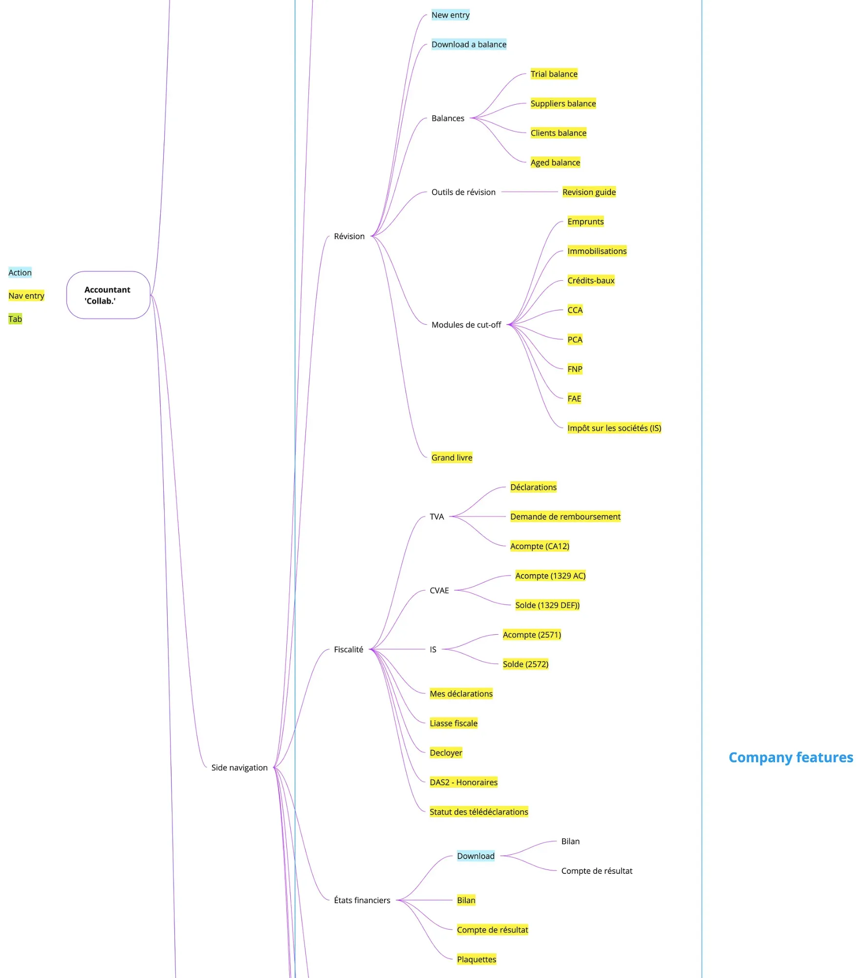
Shortly after the project began, I left Pennylane. The IC designer continued leading the redesign, including the detailed design and technical work. My role was to help create the conditions for the project to happen, frame it as cross-stream work, and initiate the IA. The detailed redesign and implementation that followed belong to the team.
The redesign made the improvement measurable
The team couldn’t release the change to a small percentage of customers first, so they reduced the risk through repeated validation: the original 10 research participants evaluated the new navigation, critical tasks were retested in Maze, and Pennylane employees used it for several weeks before launch.
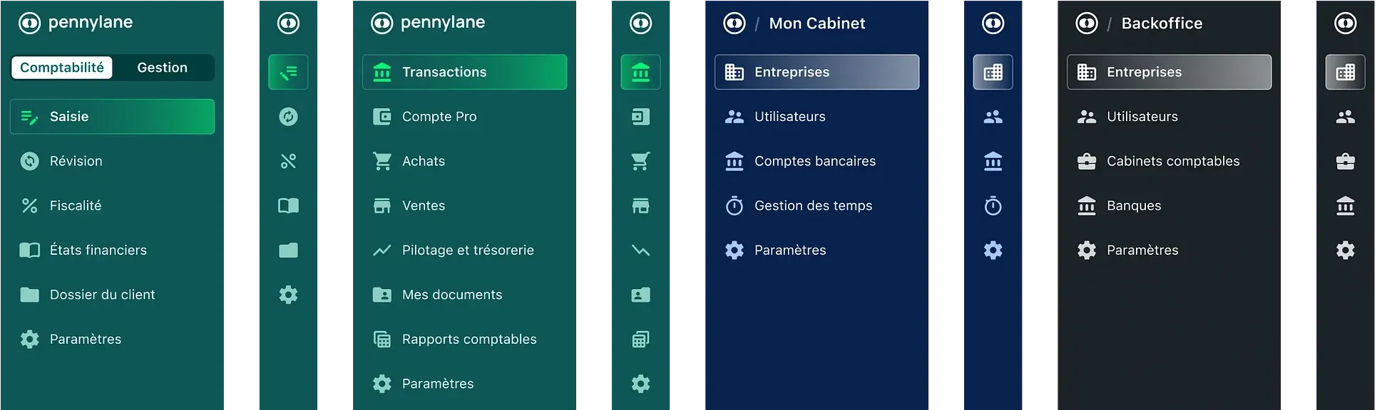
In Maze testing, the redesigned navigation achieved
47%
lower average time-to-task
The outcome I care about wasn’t only the navigation
For me, the more important change happened earlier.
- Designers took part in discovery rather than receiving its conclusions.
- Real accountants became part of regular usability testing.
- Designers presented their own work.
- Product leads experienced research directly.
- A problem that kept losing the prioritisation argument became cross-stream work.
If evidence isn’t changing a decision, producing more evidence isn’t always the answer. Sometimes you need to change who experiences it, and how.
What I’d add next time is a clearer baseline: the number of navigation-related support contacts before the work began. That would have connected the usability improvement not only to a better experience, but potentially to an operational outcome too.